

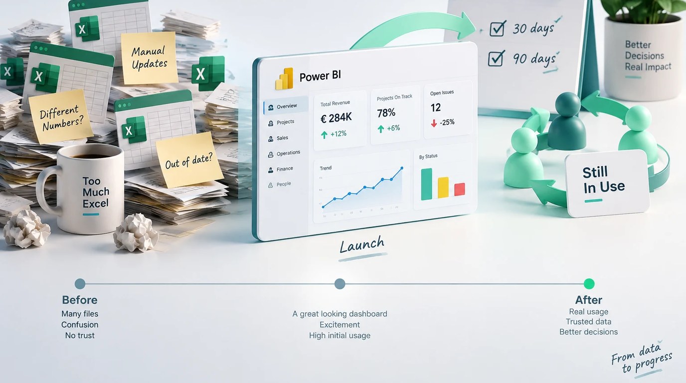
A Power BI dashboard looks good on launch day. The real test comes a month or two later, when the managers it was built for go back to their old spreadsheet. Whether a dashboard stays in use depends less on Power BI itself and more on five practices: three decisions made before anyone opens the software and two routines that run after launch.
Start With the Three Questions the Dashboard Must Answer
The most common mistake is starting from the data that's available. There is sales data, cost data and field data, so the dashboard shows all of it. A dashboard built this way turns into a decorated data warehouse, not a decision tool. Start from the other end: which three questions does someone ask again and again, and what do they do once they get an answer? For a project cost dashboard, the three questions might be: which projects are over budget this month, which are about to be, and what changed since the last review?
A good question leads to a decision. "Which projects need my attention this week?" is a question a dashboard can answer. "How are the projects doing?" is not.
Write those three questions down in plain language before opening the software. If a first-time viewer can't find all three answers within a few seconds, the dashboard isn't ready, however polished it looks. A page with twenty charts gives no answer faster than a page with three well-chosen ones. It only adds noise the viewer has to filter out.
Different roles ask different questions, and that is fine if you decide it upfront. A sales lead and an operations manager don't need the same view of the same data. One page that tries to serve both serves neither. A shared summary page with separate drill-down pages for each role holds up far better once real use begins.
Then test the questions against real behavior, not only against what people say. Sit with someone during an actual weekly check-in and watch what they click, scroll past and ignore. That teaches you more than any planning meeting. What people say they need and what they actually open are two different things.
Name an Owner Before You Build
A dashboard without a clear owner goes stale quickly, even with flawless design. The owner answers "why did this number change," is responsible for the accuracy of what feeds the dashboard, and decides when it has to change with the business. Without that person, nobody fixes a stale dashboard, because nobody feels it is their job.
Here is a common pattern. The dashboard itself isn't wrong, but nobody knows who to ask when a number looks off. People stop trusting it and go back to their old sources, because there they at least know who to ask. With a named owner, correction requests become a healthy sign. Someone still trusts the dashboard enough to report that a number looks wrong.
The owner doesn't have to be a dedicated role. In smaller organizations it is a slice of an existing role, often whoever already owns the data in the source system. Name the responsibility out loud and make sure everyone who relies on the dashboard knows it. Don't leave it by default with whoever built the dashboard, who may have moved on by the time a real question comes up.
Here is a quick test. Ask three people who use the dashboard who to contact when a number looks wrong. If you get three different answers, or none, the dashboard has no owner yet.
Design for the First Glance
A dashboard that impresses in a demo can be a warning sign. If someone has to stand next to it and explain how to read it, it has already failed the real test: standing on its own, unexplained, in week three after launch. Judge a design by how long a first-time viewer needs to understand what is happening.
Give the most important metric the top of the page. Filters, for example by date or region, belong at the side, not in the center, because they serve people who want to drill down, not people checking overall status. If nobody can explain a chart in one sentence, remove it. Every extra metric competes with the one that matters, and a crowded dashboard is harder to scan.
Color needs the same restraint as chart count. When every element competes for attention in the same bright color, the eye has nowhere obvious to go first. Keep strong color for what needs attention and leave everything else in a quiet neutral tone. That does more for a quick scan than any additional chart type.
Put the Refresh on the Calendar
A live dashboard needs a fixed refresh schedule and a named person accountable for it. A biweekly or monthly slot on someone's calendar works far better than a general promise that "someone will update it when needed." For example: the data refreshes every Monday morning, and the owner checks it before the weekly meeting.
In the Power BI service you can set this up as a scheduled refresh. A data source that sits on a company server also needs an on-premises data gateway before scheduled refresh will work. If the sources feeding the dashboard involve manual steps, each one is a separate point of failure. Ask which steps can be automated before the dashboard goes live.
Decide in advance what happens when a source changes: someone swaps a spreadsheet, adds a column or renames a field. Without that agreement, a small change in one source breaks the dashboard, and it keeps showing wrong numbers for weeks until someone notices. Add a simple check that flags an empty or repeated row before anyone sees it on a chart. If several tools hold the same figures, choose one as the source of truth first. The guide on setting up a single source of truth covers one way to do that.
The owner should also check the automation itself, not only the numbers it produces. A refresh that stopped running two cycles ago looks, at a glance, just like a dashboard that is slow this week. Confirm that the process ran and that the chart shows a plausible number. That catches the failure before someone makes a decision on stale data. By default Power BI emails the owner of a semantic model when a scheduled refresh fails, and you can add more recipients. Make sure the right people are on that list.
Check Back at 30 and 90 Days
Launch day is a poor measure of success. A high number of opens in the first weeks can come from curiosity alone, so it tells you little. The real signal comes after the curiosity fades: who still opens it, which filters get used, and which part nobody touches.
Schedule two simple checks in advance, one 30 days after launch and one 90 days after. Power BI's usage metrics report shows how many people opened a report and on which days. Add a direct question to a handful of people who are supposed to use the dashboard: do you still open it, and if not, what sent you back to the old way? Keep the questions concrete: what did you open last week, what did you skip, and what did you go back to the spreadsheet for? If two sections no longer matter, remove them. A short, focused dashboard beats a crowded one.
Start these checks with one question: do people trust the numbers? BARC's Data, BI & Analytics Trend Monitor 2025, published in November 2024, ranks data quality management as the second most important trend in data and analytics, behind data security and privacy. The report is based on responses from 1,795 data professionals. The link to your dashboard is simple: a dashboard that shows a wrong number even once teaches people to go back to the spreadsheet. A 30 and 90 day check catches that loss of trust while it is still easy to repair.
What This Looked Like in Practice
I applied these decisions when I built a data function from scratch at a previous company. Before opening Power BI, I listed every data source and who depended on it. Leadership had been working from separate Excel files for each area, and their meetings began with an argument over whose figures were right.
Once the dashboard was live, that argument stopped taking up the start of the meeting, and the discussion moved to what to do about the numbers. The full story is in the piece on moving from messy Excel files to a live Power BI dashboard.
Key Takeaways
- Start from the three questions the dashboard needs to answer.
- Name an owner before you build, someone accountable for data accuracy and for questions when a number looks off.
- Give the most important metric the top of the page, keep filters to the side, and cut any chart nobody can explain in one sentence.
- Put the refresh on the calendar, and add checks that flag empty or repeated rows before anyone sees them on a chart.
- Schedule a check at 30 and 90 days after launch and ask people directly whether they still use it.
If you're considering building an executive dashboard, or already have one nobody opens anymore, you can see how I build Power BI dashboards for small businesses.